To inject a vibrant splash of color into your current home ambiance, consider the season’s most sought-after accent shade: candy apple red. Designer Olivia Westbrooks notes that many clients tend to shy away from this hue. However, she emphasizes that conquering the apprehension and embracing the vibrancy of candy apple red can be a transformative move. “It infuses a space with vitality, warmth, and a touch of nostalgia, making it ideal for the autumnal months,” she adds.
Should you be on the fence about incorporating this fiery tone into your autumnal decor, heed the advice from Westbrooks and Julia Marcum of Chris Loves Julia, and you’ll soon master the art of adding splashes of color with ease.

Olivia Westbrooks is the creative force behind Olivia Westbrooks Interiors and the host of “Home Is Where The Heart Is” on Hallmark+. Julia Marcum is the visionary behind Chris Loves Julia, a brand dedicated to home renovation content and inspiration.
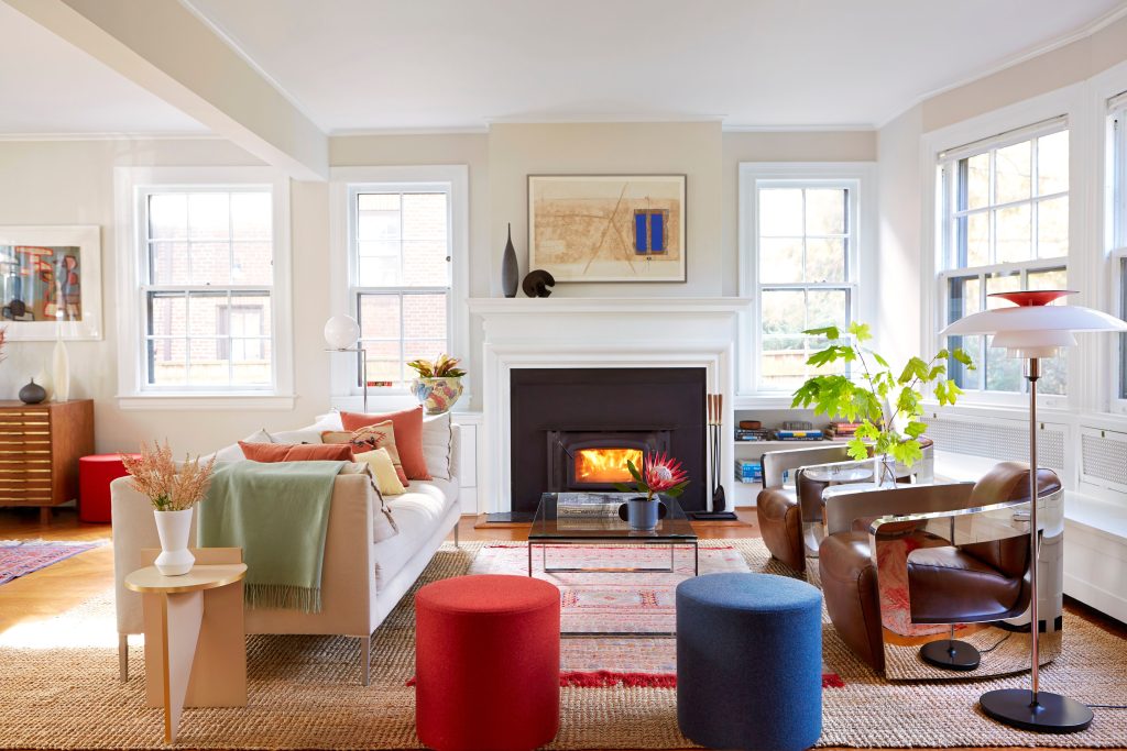
When venturing into the realm of candy apple red for the first time, it’s natural to feel a bit hesitant. Marcum suggests keeping the color’s presence subtle, advocating for no more than 10% of the room’s color palette. “This approach keeps it contemporary and avoids the trap of theme creation,” she clarifies. In Marcum’s abode, elements like a bowl of apples, red-framed photos, and a matchbook on the coffee table subtly enhance the space’s dynamic feel without overwhelming it. Westbrooks’ designs often subtly incorporate the shade across various aesthetic styles, from vintage patterns to contemporary art pieces.
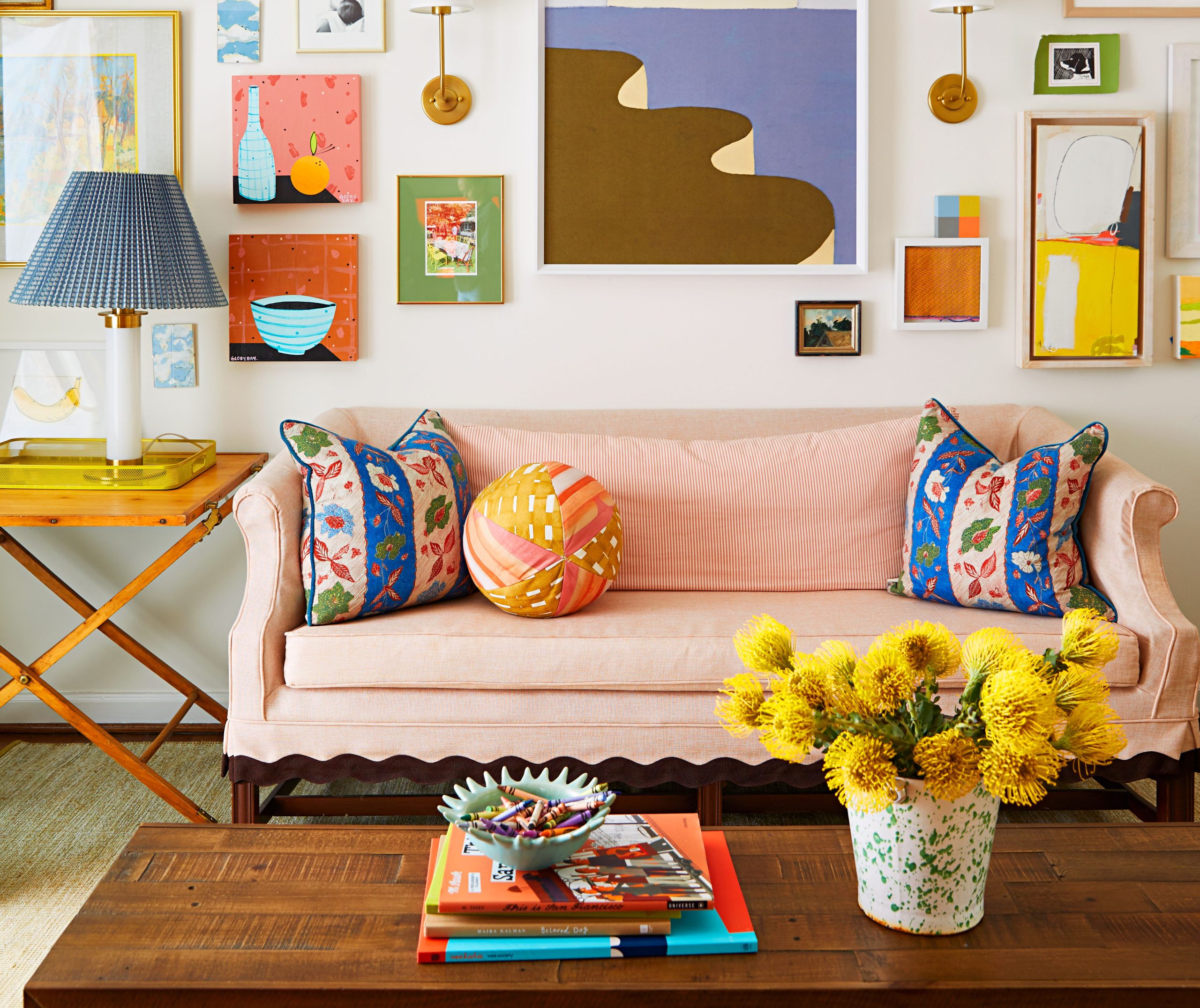
Textiles like napkins, tablecloths, and even the subtle accents on bedding, such as white sheets with a bold red trim, can seamlessly transition your home from autumn to the festive season. “Last year, I purchased a neutral tablecloth with bright red stripes, and it became a go-to for everything from Thanksgiving to Christmas and even Valentine’s Day,” Marcum shares. The adaptability of quality linens with a pop of color is invaluable, often resulting in a timeless rather than trendy look. “It’s like the room’s painted nails,” Marcum remarks. “A color that stands out and never goes out of style.”
Incorporating red into your decor calls for thoughtful consideration of complementary shades. Bright greens and yellows are best avoided, but warm, earthy tones create a harmonious pairing, especially in Marcum’s traditionally styled, moodier spaces. “I adore candy apple red paired with a soft, olive green; the combination feels both unexpected and refreshing,” she notes. “But my favorite pairing is dark brown. This pairing, whether in a throw blanket, velvet pillow trim, or even in fashion, is a stunning contrast.”
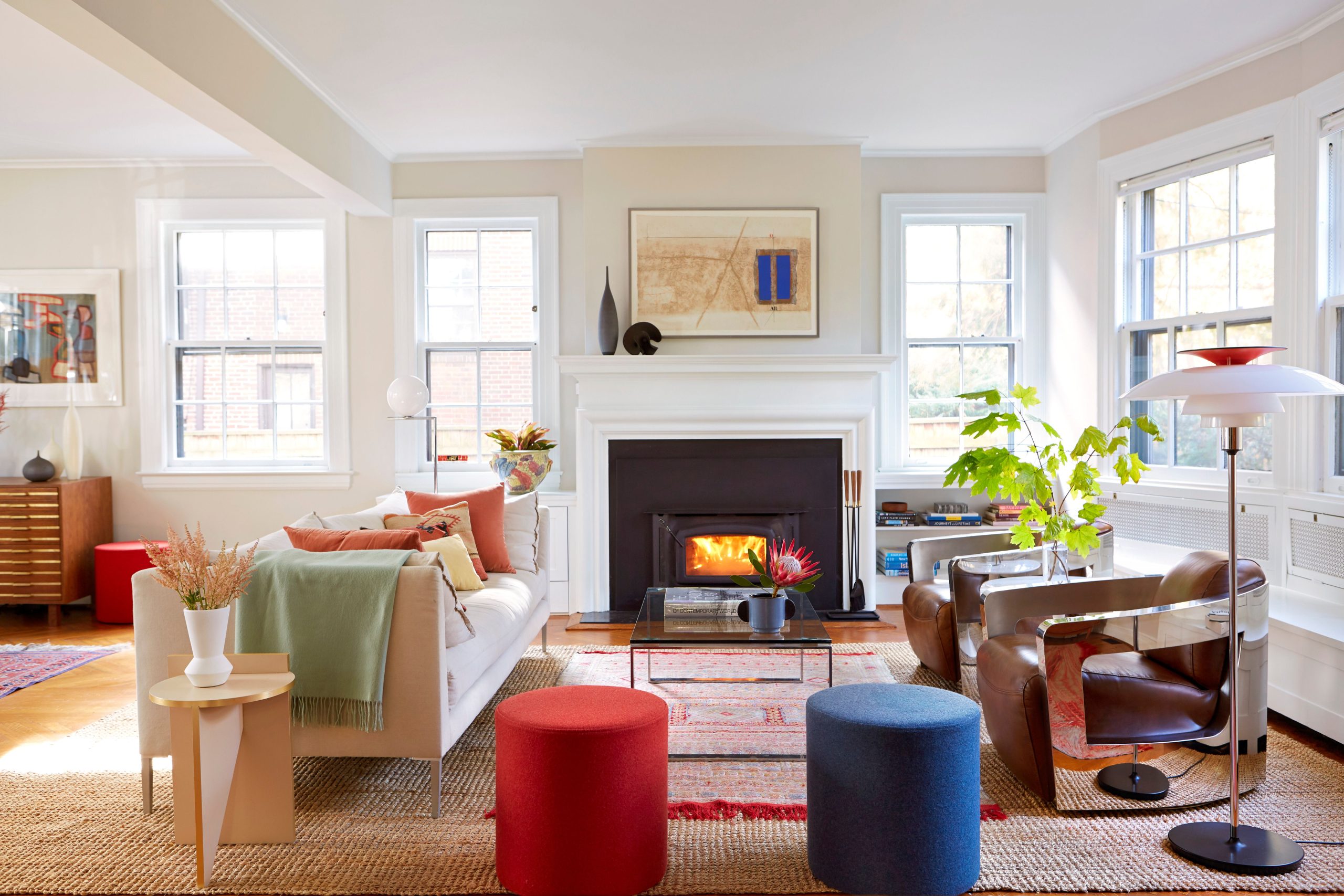
You needn’t make a significant commitment to your furnishings to enjoy the joy of candy apple red. Westbrooks suggests opting for small chairs or stools that can be easily moved or repainted to create a cheerful gathering area. She emphasizes that limiting the red accents in your space can still yield a transformative and energizing effect without being overpowering.
Seasonal flowers offer a simple and low-commitment way to introduce the season’s charm to your home. Westbrooks enjoys layering red blooms like poppies or dahlias to add a playful touch without dominance. She also suggests considering the vase or container as a means to integrate the flowers with your existing decor. For a bolder, more modern aesthetic, Westbrooks prefers gold, while Marcum recommends antique brass for a warmer, more traditional feel.
If you’re ready to make a more significant statement with candy apple red, consider a fresh coat of paint on your front door. Westbrooks explains that this bold move can inject energy into your home’s exterior. Imagine a scene of crisp autumn leaves, towering chrysanthemums, and vintage pumpkins at your doorstep, with a candy apple red door ready to embrace the season. Will you join in?


